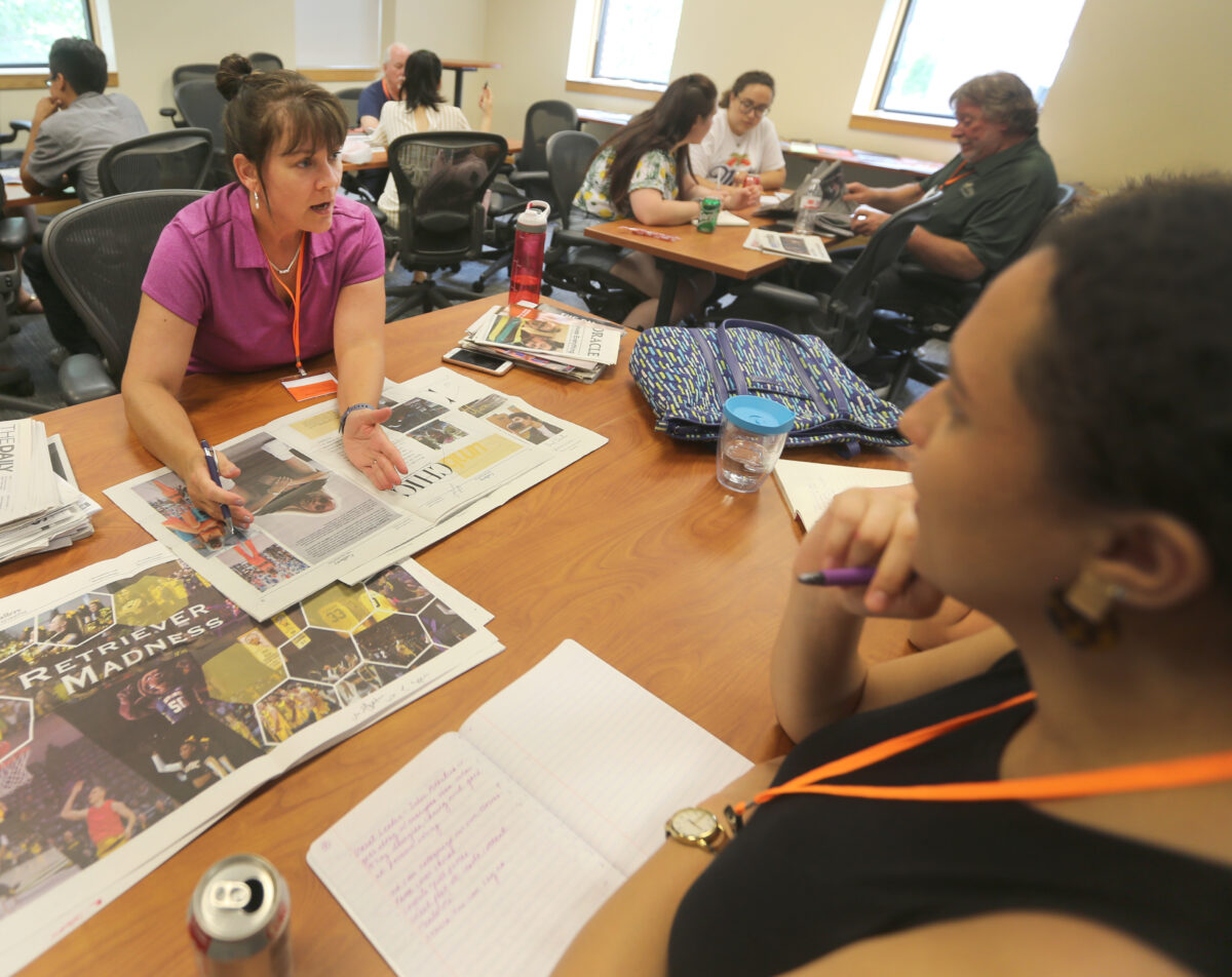
Editor, adviser can assume coaching role
By Melanie Wilderman
I first heard of Chip Scanlan’s “The Coaching Way,” in 2004 when I was preparing to teach my first college-level class, Introduction to Media Writing, as a very green master’s graduate and new adjunct instructor for my alma mater. I was 23 years old and, like many new instructors, terrified my students would think I was a fraud. “The Coaching Way” saved me that first semester. It guided me as a teacher as much as it helped guide my students.


For those who may not be familiar, Scanlan, a seasoned journalist and former writing instructor for The Poynter Institute, detailed his approach as an editor in a 2003 Poynter article. He said he approached coaching journalists first with the question, “How can I help?” Then he listened to the answer. Sounds simple, right? Even Scanlan admitted this, but it’s an important first step, and what follows is a more intense progression of open-ended questions throughout the writing process and a back-and-forth between editor and journalist (or, in educational settings, between teacher and student) that requires participation from both parties. He calls this style “The Coaching Way.”
Many of us who teach journalism or other forms of media writing are comfortable with Scanlan’s method and consider it ideal for teaching our students to write. But a little secret I discovered: It also works brilliantly when teaching design. In his 2003 article, Scanlan wrote that the coaching method is “based on the idea that the power to recognize a story’s problems as well as the means to fix them lie within the person reporting and writing the piece.” Replace“story” with “design project” and “reporting and writing” with “designing,” and it becomes clear that these tactics have promise for developing skills other than writing. The crux of “The Coaching Way” is that it’s simply an effective and potent teaching style.
Because I’ve been attached to this method for so long, a few years ago I began to realize I was using it automatically in other courses, specifically a one-credit special course I’ve been teaching each fall since 2017, Graphic Design for Media Storytelling & Promotion.
The method is helpful especially when you have a class full of students starting at different levels of skill and experience, ranging from “I have never opened InDesign,” to “I do this stuff daily for my job.” I started paying more attention to “The Coaching Way” tactics I was using in the design class and have developed step-by-step instructions that can be used for just about any basic design assignment, for example, a business card. The setup and instructions for this process follow:
The Idea
To use “The Coaching Way” method to coach students with varying levels of design competence on a basic project early in the course.
The Goals
- For beginning design students: Introduce and use basic InDesign tools.
- For intermediate design students: Showcase use of InDesign skill within defined parameters.
- For all students: Create a personal business card while considering these *seven elements in the design: dominance, balance, hierarchy, unity, color, space and gestalt.
- For me as the instructor: Split my time well between beginning and intermediate students, encourage students to take a primary role in their design work through all stages from planning to final draft, help beginners become more comfortable with software and basic design concepts, and challenge intermediate students to work creatively within strict parameters.
*If you Google “elements of design” or peruse design textbooks, you will come across many lists with varying numbers suggesting there are seven or 10 or 25 “basic elements of design,” or you might find a listicle with a headline like, “The only five design concepts you’ll ever need to know.” The lists are plentiful and the content overlaps a lot. The seven elements of design mentioned above, and explanations and examples of each as I teach them, are a compilation coming mainly from three design textbooks: The Elements of Graphic Design by Alex W. White, The Non-Designer’s Design Book by Robin Williams, and Design Elements: Understanding the Rules and Knowing When to Break Them by Timothy Samara.
The Assignment
Design a basic business card, within parameters set by instructor. I use the business card as the first assignment. It’s a small project, not likely to overwhelm a beginning designer.


Step 1: Begin with lectures and examples introducing students to the seven design elements previously mentioned, as well as a brief introduction to color theory. Concerning color, I mainly focus on a simple color wheel and complementary colors along with how color is used to convey tones or emotions. We go deeper into color theory later in the semester.
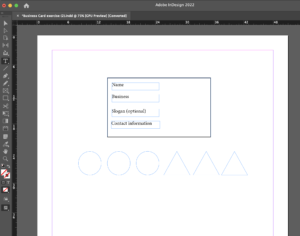
Step 2: To begin the project, students open an InDesign document I have previously set up for them. Note: You do not have to use InDesign. Just about any design software, including open source programs, will work for this simple project. I purposely limit the elements they are allowed to put into this assignment to keep it simple. This serves to calm the apprehension of beginner students but can also challenge the more advanced students to be creative within these restrictions; it can be a lesson that simple design can be creative and interesting. The document I set up for them looks like this:

Step 3: I explain that their goal is to design a business card with the text information they see in the document: name, business, slogan (optional) and contact information. For the design elements, they may use only the shapes they see in front of them. They can, however, use any fonts and colors they choose, and they can distort and change the shapes in any way they see fit. They must use at least one circle or one triangle. They can delete extra shapes, but they cannot add any. Instructors can certainly make changes to these parameters , but I suggest keeping the shapes simple, and the written content minimal.
Step 4: Students start working. At this point, it is often helpful to divide students into groups based on their levels of design skill or experience. I normally assess this with a simple survey before this class meeting or at the beginning of class.
- For those who need more introductory software help: I get them in a group and show them how to use the basic tools to move objects, add and change text, change the size or color of objects and text, and other basics.
- For those with more experience: I instruct them to jump into the design work and challenge them to try a tool in the software that they haven’t used before. I encourage them to play and experiment before they get down to the specific goals of the assignment.
- After I get the beginners more confidently working in the software, I transition to “The Coaching Way” tactics. I circle the classroom and start by asking individual students (remember Scanlan’s first question), “How can I help?” Their requests are usually all over the place to start, and that is fine. People approach design in different ways. The important part on my end is to listen carefully to each question or request. During this time, I also encourage students not to get too hung up on one small detail and to work toward getting all elements on the page.
Also at this stage, I look for opportunities to ask the more advanced students to lend a hand every now and then to their beginning-designer peers. This can help prevent my spending too much time with any one student and increase the confidence of the more advanced students. As a bonus, I will often learn something new from a student. Design programs include so many tools and variations, I find it impossible to know them all, even in software I’ve been using for 20 years.
Step 5: Once the students have something partially designed, I can delve deeper into coaching. Just as I do when coaching writers, I ask the design students open-ended questions to get them thinking and participating in their own work and revisions, not just awaiting my instruction. For this assignment I might ask:
- What colors strike you and why?
- What are you trying to convey with your font choice?
- What do you think is holding you up at this point?
- What do you like/not like about what you have so far?
- Ideally, what tone or message do you hope to convey when this is complete?
Step 6: Depending on the amount of class time you have, Step 6 might need to happen in the next class session because students need to have a full draft of the project before you proceed to this step. In a full draft, all the elements the assignment asked for are there, but some revisions will be necessary before a final draft. Once students have a full draft, I sit down one on one with them to discuss it. This doesn’t have to be a long discussion, but it is a vital step in the coaching process. I have them tell me what they like or don’t like about the first draft. I ask them what was a challenge for them. We use a rubric that includes those seven elements of design from the lecture, and I have them explain to me how they considered each element. Key point: The students do most of the talking in this meeting. When they finish, I point out any inconsistencies in their understanding or use of the design elements and add any other advice I might have for revisions for the final draft.
Step 7: After these brief meetings, students finish revisions and turn in the final drafts. Since this is the final step, it’s a good time to note how I talk about grading in this particular course. While I do not use a sliding scale grading philosophy in most of my classes, it makes sense to do so in this class. As mentioned previously, the students usually come in with widely differing abilities and experience with design software and concepts. Additionally, this is an elective course, which also makes me feel more comfortable with this strategy. A note about grading from my syllabus explains it this way:
Due to the nature of the course, and the varying levels of students’ skill and experience in graphic design practice and software, assignments will be graded using a completion method and with consideration to each student’s skill level upon entering the course. For example, on a project, you will be asked to take into consideration a certain number of elements in the design. I will not grade you in comparison to other students for the skill of design, but on evidence of how you considered and attempted each element in your work.
Student reactions/outcomes:
In student feedback on university evaluations for the last three years, on a 5-point scale with 5 being most positive, the majority of responses to questions about the class are 4s and 5s with a smattering of 3s, and few 1s and 2s. I do find it easier to receive higher scores in an elective course, so I don’t mention these scores to brag but rather to indicate how I have noticed the coaching method being received positively. Students can also provide written responses on these evaluations; some comments relevant to the coaching method follow:
- Projects were flexible for a range of skill levels.
- Melanie was very patient and taught us things that catered to all levels of knowledge with Adobe. The assignments were easy to learn and test out different techniques.
- I loved how Melanie was intentional with each of us and made us feel comfortable to speak up.
- It taught me some basic techniques I did not know with InDesign, Photoshop and Illustrator. I came in knowing limited information and I felt way more confident leaving the class.
- I thought the class was really well-organized and did a great job of exposing us to the design platforms and giving us time to be creative and play around.
- We were able to tailor the assignments to help our own goals, so the course was applicable to everyone.
- I came out of it extremely proud of myself.
- With the class being so hands-on, we were able to learn through practice in class and have the availability of the professor to help when needed.
- She was able to teach so much in such a short amount of time, and was able to answer and provide help to various levels of knowledge of the programs.
- The individual work structure allows advanced students to dive in while new students receive assistance.
- The amount of time we got for exploration in this course was very valuable. Being dedicated to this explorative process was very helpful in increasing our skills and creativity.
I do see some complaints in the evaluations, mostly from the students who come in with the most design experience feeling like they need more of a challenge. This is not surprising, and I continue to look for ways to challenge those students. Some are looking for challenges with software they don’t already know or tools they don’t know within software they have used, while others are looking for challenges concerning the type of projects assigned.
When Scanlan suggested that “The Coaching Way” gives reporters the power to fix problems in their own stories, he was also quick to note he is not suggesting reporters don’t need editors. He clarified that the editor’s role is essential to the process. I echo Scanlan on this sentiment and do not suggest that using the coaching method for design lessons will mean the students do not need us as teachers. They need us very much in these coaching moments. Of course, after the lessons stick, there is little that provides more joy than watching a student successfully teach someone else the very thing you first taught them. After 18 years of instructing at the college level, I do not have many of the same fears or worries that I did back in 2003, but I do still hold onto “The Coaching Way” as closely as I ever did and still allow it to guide me as I guide my students.
References
- Samara, T. (2014). Design Elements: Understanding the Rules and Knowing When to Break Them. 2nd ed. Rockport Publishers. Beverly, MA.
- Scanlan, C. (2003, May 14). The Coaching Way. Poynter.org. Retrieved from https://www.poynter.org/reporting-editing/2003/the-coaching-way/
- White, A. (2011). The Elements of Graphic Design. 2nd ed. Allworth Press. New York, NY.
- Williams, R. (2014). The Non Designers Design Book. 4th ed. Peach Pit Press. Pearson Education. San Francisco, CA.
 Melanie Wilderman, Ed.D., is an associate professor of journalism and director of Oklahoma Scholastic Media at Gaylord College, University of Oklahoma. A former news reporter, she teaches introductory media and writing courses, multimedia journalism, and media design. Her research interests include scholastic journalism, journalism education, community journalism and service-learning. Wilderman contributes feature pieces regularly to several magazines and has had scripts produced for both the stage and short films. She was named the 2012 Oklahoma Society of Professional Journalists Teacher of the Year and, in 2019, the Austin Revolution Film Festival’s Randall Greenland Screenwriter of the Year. mgwilderman@ou.edu

