“Redesign. The mere word can strike fear into a veteran adviser.”
By Ron Johnson
Indiana University
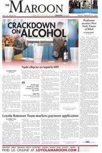
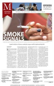
The adviser to The Maroon, said he was looking to give the newspaper a boost.
Michael Giusti, Student Media Adviser at Loyola University New Orleans, said the newspaper had a strong tradition, but it was time for an upgrade.


“We have traditionally done well in many areas — ones that I am personally strong in as a professional journalist — writing, editing, story selection,” Giusti said.
“But we were missing the whole package. We found that people didn’t tend to consume that great coverage because they weren’t drawn to it.”
Design was the piece that would pull it all together, Giusti said. “But I wasn’t the guy to lead it. I joke that when it comes to design, I am a technician, not an artist.”
Well, I’m no artist, either, but I signed on to help the folks at The Maroon in spring 2014. From advising my own newspaper staffs at three universities of different sizes, I knew the potential. I also I knew the pitfalls.
Redesign. The mere word can strike fear into a veteran adviser.
Yet a redesign is an opportunity. It can be as simple as updating the outdated design furniture. It can be a broader reflection upon how to engage with your readers.
Before you even start playing with type, as designers are wont to do, much more must be considered. Begin the process with an open-minded, critical assessment.
Evaluate your product. Is this the best format? Are there other options? How do we make the most with what we have?
- Your process. Are you capable of changing how you cover campus? Can you improve production along the way? Can you meet deadlines with these changes?
- Your readership. Who’s reading your print product? Whom would you like to reach?
- Your competition. How does your print product interact with online, social media and mobile? With your competitors?
- Your role models. What publications and sites inspire you?
- Your content. How can you stretch your story forms — and match the form to the content?
- Your staff and resources. Do you have the visual journalists you need on staff? If not, recruit them. And cross train yourselves.
- Your presentation. Your content is crucial, but is your presentation impeding readers from engaging with it?
That evaluation prompts some soul-searching. But then it’s time to talk about the nuts and bolts of design, the fundamentals, the trends.
What makes a design work? What diminishes it? We need something more than “that looks pretty” or, my favorite, “it catches the eye.”
This is when designers need to become newsroom leaders, to teach their colleagues a design language. Many resources are available to help. Put them to work. Haul out this handout of my elements of design. Use it to critique your paper.
Then, with a better grip on fundamentals, we build a list of targets.
- The content. Just how good are you at covering your campus? Is your content relevant? Are you reaching across the spectrum of story forms, or are you just lucky to get a story and a photo to go along with it?
- The packaging. Does your front page offer a centerpiece package, with a dominant photo? Does that package include a lead headline, a deck and text on a grid?
- The simplicity. Look at the internal margins, or lack thereof. In the centerpiece package, is there white space to set off the headline and the text? That space enhances the content. When you look at a page, you should see the content, not the design.
- The variety. In storytelling. In presentation. In packaging.
So much to discuss. So much to plan. But now that I’ve thrown a slew of questions at you, I’ll try to answer a few of that you probably have.
How much does design matter?
It must matter a great deal, or manufacturers wouldn’t obsess about packaging.
You can muddle along with a so-so design, but I don’t think we should settle for any impediments between readers and our content.
How far does a redesign need to go?
What is the goal of a redesign? A redesign can be a tweak. If your typography isn’t working, fix it now.
A redesign can be an overhaul. That means step back, assess what’s working and what isn’t working.
Do we need someone to help us?
Not necessarily, if your staff has design skills. Even then, some outside eyes can’t hurt. Engage your alumni. Get critiques from professionals at workshops and conferences.

Just who does the redesign?
The students in charge of the newspaper. Not the adviser. Not an outside consultant.
It’s the students’ newspaper, and that’s been a cornerstone of every redesign I’ve been part of.
Should we change the format?
That depends upon your printer and your budget.
I’ve talked to some staffs who want to convert their broadsheet into a tab, to make it easier for readers to handle. That’s fine.
I’ve talked to some staffs going the other way, from tab to broadsheet, to make their newspaper more credible. That’s fine, too.
I’ve talked to some staffs who couldn’t change or wouldn’t change. And that’s fine as well. Talk to your printer, and ask what you can do to help improve print quality.
Should we change the flag?
Some advisers cringe at the thought. A change in the flag can mean a complete re-branding, a costly process.

So talk this one through. It may be time to update the flag, with typography reflective of the 21st century.
It may be time to simplify what you have. To repair the typography. To strip off the gimmicks and clarify your brand.
It may be time to update your brand fully, and then update your signage as the budget allows.
Bottom line? Work on the flag, but don’t obsess about it. I once had a staff spend most of its redesign energy on the flag. They added this. They added that. The result was a too-heavy, too-colorful flag that overpowered the content on the page.
Should we change the typography?
Likely, but know what you’re doing.
Too many college newspapers have glaring type problems, like tight linespacing and varying column widths. If you’re among them, fix your typography now.
How many fonts should we use?
Set some limits. Don’t let your typography get out of hand.
For text, start with a strong serif. Not Times, but at least Times New Roman. Shy away from complicated serifs.
For headlines, consider both a serif and a sans serif. Select fonts that offer four or five widths, with condensed or display versions.
For graphics text, use a simple sans serif.
That’s it.
If you want to work with a gazillion fonts, consider advertising production. In news, we set our structure, and then we’re creative as we work within its flexibility.
I’m a blue-state liberal when it comes to content and design, but I’m a red-state conservative when it comes to type. Know what you’re doing. Choose the right tool for the job.
What if our adviser is scared to change?
I relate. At age 56, I’m an adviser set in my ways. I want my morning cup of coffee and my recliner at day’s end.
But don’t let the fear keep you from improving. Some college newspapers look as if they’re designed for the 1990s. Or 1980s. Or 1970s. (That’s when I had hair, disco shirts and platform shoes. Point proven.) Design issues can distract readers and prevent them from engaging with the content.
What if our visuals aren’t strong enough?
I’ve had many a student, many an adviser say they can’t run large photos because theirs are not good enough.
They never will be, unless you start taking some risks with larger photos.
Give your photographers and illustrators a platform. Show off their good work. They’ll step up and begin photographing with design concepts in mind.
What’s the best way to emulate a design we like?
Well, don’t steal it.
Yes, that has happened, and designers have been fired for it.
So don’t carbon copy someone else’s design. Learn from it. Study the storytelling, the packaging and the visuals. Study the typography, the white space.
Take those principles and put them to work.
Realistically, are there other risks?
Yes. You might tackle more than you can handle. You might have to learn it by doing it.
Hmm, doesn’t that sound like the wonderful world of collegiate media?
Today’s journalism is a moving target, and our print editions are taking hits in circulation. If they look bad, we don’t stand a chance at maintaining that diminishing revenue stream.
Does a redesign really change how we prepare to interact with readers?
For his Loyola students, Michael Giusti says yes.
“Now in their planning meetings, they are asking ‘So how can we show this story visually,’” he said. “They don’t always pull it off, but they are at least thinking about it in advance.
“They draw up sketches of their pages a week in advance, and they come in with drafts on paper a day in advance. They are really thinking ahead on the process.”
Once we redesign, can we keep the momentum?
That’s the biggest hurdle, Giusti says.
“The original crew that did the redesign has now graduated. We are working on Generation 2, and they are getting a little sloppy in their approach.
“Since this isn’t my specialization, it is hard for me to keep them on the right path,” Giusti said. “We are bringing some key people to ACP to retool, so I hope that will help, but we may be getting to the point where we need to pursue some extra outside help.”
Does design help us at the Indiana Daily Student newspaper? You bet. Sometimes we succeed. Sometimes we stumble. That’s part of the fun.
But if our only strength is design, we’re in trouble. The design propels our content — the breaking news, the narratives, the features, the photos, the illustrations and the graphics.
Both design and content are a process. We’re at our best when we push the limits of our structure, when we take a risk, when we collaborate on that risk to give it the greatest chance to succeed.
 Ron Johnson, CMA president from 1993-95, directs student media at Indiana University. He edited six editions of The Best of Newspaper Design for the Society for News Design. See more of his students’ work and more of his resources at ronjohnson77.tumblr.com.
