Out of the box ideas may sound intimidating, but they’re really not
By Holly J. Morris
University of North Georgia
Students are plenty comfortable with the melding of pictures and words. That’s what memes are (this kind) and, arguably, emoji. So the alternative story form — a broad journalism genre that often combines graphics and text in ways beyond “story block with photo” — seems like a natural idiom for college media.
Or maybe not, based on a scouring of the engagement table at this year’s CMA conference in New York. Most of the examples on offer were traditionally texty.
“My students are becoming really proficient creating that fundamental foundational content of print and broadcast media,” said Lee University assistant professor and student media adviser Michael Finch. (For the record, the Lee Clarion wasn’t on the engagement table — it’s online-only.) “I’ve found a little bit of resistance in moving away from that. It’s actually taken a lot of work to get them broaden the horizons of their imaginations.”
Adding alt story forms to a publication, online or off, need not be intimidating. As shown by the examples below, it helps to have designers on staff. But tools like Piktochart and Canva put infographics, for example, within reach of the non-graphically inclined. Qzzr makes embeddable Buzzfeed-style personality quizzes. Odyssey enables map-based storytelling.
Here’s a look at seven alternative story forms — online and print, simple and design-heavy — and how the publications they appeared in made them happen.
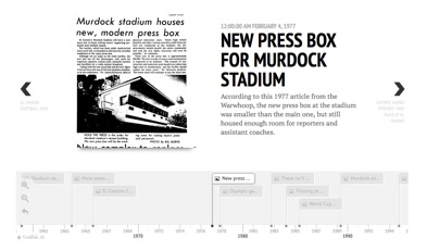
- Murdock Stadium interactive timeline (Item 1)
- The Union, El Camino College, Torrance, California
Between its 1949 dedication and 2013 demolition, El Camino College’s original Murdock Stadium (its replacement opened last year) hosted movie shoots, World Cup matches, Olympic soccer and six decades of college football.
“I knew how important the stadium was to so many,” said Jessica Martinez, who in 2014 was a second-year student at El Camino College when she started building an interactive chronology of the stadium. “I created the timeline as a way to preserve and remember some of the many things that had happened there.”
put together the Murdock interactive, Martinez used Knight Lab’s TimelineJS, an open-source tool that generates timelines from Google spreadsheets and assorted sources of multimedia content. There’s no need for coding skills (though if you have them, you can do some serious futzing).
Martinez worked on the timeline for much of her spring semester, going to the school’s library and unearthing newspaper clips marking milestones in the stadium’s history. The finished timeline won CMA’s Pinnacle Award for Best Online Infographic in 2015.
Martinez, now a senior at New York University, encouraged journalism students to give TimelineJS a go.
“We worked with [it] in my advanced reporting class at the beginning of this semester,” she said via email. “I impressed my professor and classmates with how much I already knew about it.”

- https://www.youtube.com/watch?v=XBW0H1P2alk
- #FreshLee campaign (Item 2)
- Lee Clarion, Lee University, Cleveland, Tennessee
The Lee Clarion is taking the tried and true “get to know an average freshman” story from static profile into innovative UGC (user-generated content) territory. That “average freshman” is creating some content herself through a series of vlogs; the Clarion staff will write/produce some segments; and the #FreshLee hashtag will tie it all together.
Finch, the Lee professor and adviser, said the format was inspired by Clean & Clear’s “See the Real Me” campaign, in which teens — the non-celebrity kind — talk about their lives and challenges in short videos.
“I was looking for ways to engage with the students in a completely digital world,” Finch said. “If we have a freshman going through x, y or z, her narrative would be something that could be instructional or help students feel like they’re not alone. That’s a different thought process than legacy press thinking.”
Giving the freshman the chance to speak her own mind gets at another value integral to communicating with the college audience: authenticity.
“A real reason that the user-generated content works and can be a valuable part of a student media content strategy is because Gen Z and millennials value authenticity to such a high degree,” Finch said.
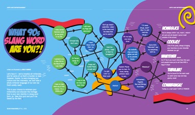
- ”What 90s Slang Word Are You?!” flowchart (Item 3)
- SCAN Magazine, SCAD Atlanta
Molly Morris’ totally tubular flowchart was inspired by her formative years in the 80s and 90s.
“I’m like a ‘borderline’ millennial,” said the graphic design student at Savannah College of Art and Design’s Atlanta campus, via email. “Most students who work at SCAN (and attend SCAD) have only heard about these decades as some alternative universe of pegged pants and Aqua Net,” she said.
After research that required watching episodes of “The Fresh Prince of Bel-Air,” “Full House” and “Step by Step,” Morris created a spread rooted in ‘90s pop culture’s splashy aesthetic, rather than “a modern design that served a different time in history.”
SCAN magazine’s editors always try to add a visually driven spread to each issue, Morris (or “Homeslice,” according to her flowchart) said. The staff’s creative process lends itself to the approach.
“As an art school, I think we’re different than most publications in that the people creating the content see how something looks first, and build the story to match that visual inspiration,” Morris said.
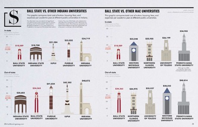
- Ball State cost comparison (Item 4)
- Ball Bearings Magazine, Ball State University, Muncie, Indiana
Infographics and visually driven layouts abound in Ball Bearings Magazine. Its Fall 2016 issue, for example, included graphics illustrating the horrors of climate change, an easy-to-parse one-page table of voting data and an annotated illustration showing how the human brain makes decisions.
The chart above, which uses landmarks from Mid-American Conference universities to compare annual student expenses, accompanied a Spring 2016 story about rising costs and the university’s lack of financial transparency. The designer created the building illustrations and the chart in Adobe Illustrator.
Roth Lovins, the art director of Ball Bearings when the chart was created, said the staff approaches story format by asking first, “Would it be easier for the reader to interact with this information in a visual format or in a traditional story?” The art director takes it from there, usually working with a designer who does both the research for and the layout of the graphic, Lovins said via email.
Graphics draw readers into a story — or might be the only thing they read. “So we make sure that [a graphic] doesn’t explode information at them, but shows them something in a simple-to-read format,” Lovins said.
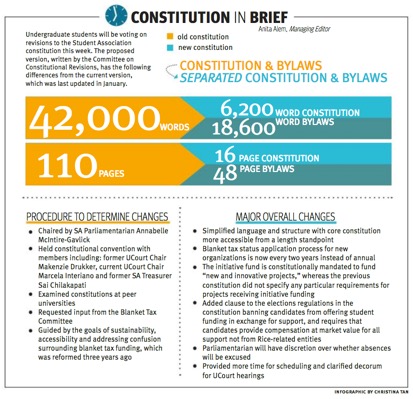
- Item 5
- Assorted graphics (Item 6)
- The Rice Thresher, Rice University, Houston, Texas
The Rice Thresher’s energetic layouts and plentiful visual elements make it a standout in a field of college papers with more demure aesthetics.
“We’ve been striving to emphasize design elements in the past year,” Christina Tan, art director of the Rice Thresher, said via email.
Ideas flow both directions at the Thresher: Editors can request graphics and illustrations, and designers can suggest graphic treatments. The staff look to Behance and Pinterest “to generate ideas on aesthetics and flow,” Tan said.
For example, the content of the “Constitution in Brief” graphic, above, Tan said, “as a story would have been rather dry — so instead, we made it into a fun infographic that highlighted the word count changes, who helped make the changes, and more.”
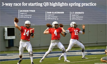
An image and a bit of text can be as effective as a full-fledged infographic, Tan said. (It’s also easily doable by a non-designer.) Take the starting quarterback story, above: “Sometimes placing text in an appealing manner over a photo makes the graphic interesting and explains content in a concise manner.”

- 10 Times Drake Was So Us During Syllabus Week (Item 7)
- Grand Central Magazine, Central Michigan University, Mount Pleasant, Michigan
The GIF listicle (as massively popularized by Buzzfeed) is one tool in Grand Central Magazine’s repertoire of multimedia and visually compelling stories.
“For particularly broad, ‘wow-this-is-so-relatable’ type stories, our audience seems to engage better with listicles over, for example, a long-form written piece with stories from other students relaying their back-to-school horror stories,” said Grand Central staffer Tessa Harvey, who created the listicle above.
Such shareable content is “particularly important to building a following early in the school year,” Harvey said via email.
Gif listicles are relatively easy to create: Just grab some Creative Commons gifs off giphy.com and go crazy with the gifsticles.
Not too crazy, though. “Too much, and our audience won’t take us seriously,” Harvey said.

Holly J. Morris is a lecturer of journalism and the student media adviser at the University of North Georgia. She worked at the Washington Post Express for 12 years, as well as National Geographic and U.S. News & World Report. She holds a master of science degree in journalism from Columbia University and a couple of wholly unrelated degrees from Emory University.
